- Page 1
- Page 2
- Page 3
- Page 4
- Page 5
- Page 6
- Page 7
- Page 8
- Page 9
- Page 10
- Page 11
- Page 12
- Page 13
- Page 14
- Page 15
- Page 16
- Page 17
- Page 18
- Page 19
- Page 20
- Page 21
- Page 22
- Page 23
- Page 24
- Page 25
- Page 26
- Page 27
- Page 28
- Page 29
- Page 30
- Page 31
- Page 32
- Page 33
- Page 34
- Flash version
© UniFlip.com
28
Onstream
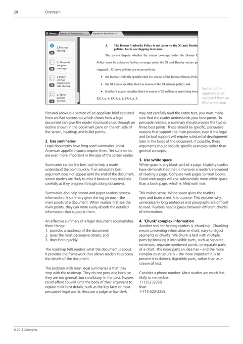
Section of an appellate brief, captured from an iPad screenshot Pictured above is a section of an appellate brief captured from an iPad screenshot which shows how a legal document can give the reader structural clues through an outline shown in the bookmark pane on the left side of the screen, headings and bullet points. 2. Use summaries Legal documents have long used summaries. Most American appellate courts require them. Yet summaries are even more important in the age of the screen reader. Summaries can be the best tool to help a reader understand the point quickly. If an advocate’s best argument does not appear until the end of the document, screen readers are likely to miss it because they read less carefully as they progress through a long document. Summaries also help screen and paper readers process information. A summary gives the big picture – the main points of a document. When readers first see the main points, they can more easily absorb the detailed information that supports them. An effective summary of a legal document accomplishes three things: 1. provides a roadmap of the document; 2. gives the most persuasive details; and 3. does both quickly. The roadmap tells readers what the document is about. It provides the framework that allows readers to process the details of the document. The problem with most legal summaries is that they stop with the roadmap. They do not persuade because they are too general, too conclusory. In the past, lawyers could afford to wait until the body of their argument to explain their best details, such as the key facts or most persuasive legal points. Because a judge or law clerk may not carefully read the entire text, you must make sure that the reader understands your best points. To persuade readers, a summary should provide the two or three best points. These should be specific, persuasive reasons that support the main position, even if the legal and factual support will require substantial development later in the body of the document. If possible, these arguments should include specific examples rather than general concepts.
3. Use white space
White space is any blank part of a page. Usability studies have demonstrated that it improves a reader’s enjoyment of reading a page. Compare web pages to most books. Good web pages will use substantially more white space than a book page, which is filled with text. This makes sense. White space gives the reader’s eyes and brain a rest. It is a pause. This explains why unnecessarily long sentences and paragraphs are difficult to read. Readers need a pause between different chunks of information. 4. ‘Chunk’ complex information Another tool for helping readers is ‘chunking’. Chunking means presenting information in short, easy-to-digest segments or chunks. We chunk a text with multiple parts by breaking it into visible parts, such as separate sentences, separate numbered points, or separate parts of a chart. The more parts an idea has – and the more complex its structure is – the more important it is to present it in distinct, digestible parts, rather than as a stream of text. Consider a phone number. Most readers are much less likely to remember: 17135232358 than 1-713-523-2358.
© 2013 Xchanging